Awesome Blog!!!

.
This link is to my favorite blog that I've encountered so far. Sure, it doesn't really have much visual appeal, but the subjects that Craig Weller writes about truly inspire you to realize what you haven't before about your life. Take a look, you won't regret reading this blog.

3 Awesome Ads

I think this is a very clever way to promote the Finding Nemo movie. To some, it may seem traumatizing, but it is still very well designed. I like the layout of the meal, with nemo's head coming out of one piece of sushi.
I really like this advertisement for a job website with the really realistic looking side panel. This is a very clever design and quite comical as well.


This image of a urinal is very funny. The images and facial experssions on the women's faces are priceless. This type of "advertising" is very clever and intelligent, giving men a self condfidence boost when they use the bathroom.

TNT Logo


My logo for the T-NT design is very dynamic because of the many long, straight lines going around the logo. I also used closure for the "N" in T-NT, by not drawing a closed-in letter. The shapes around the "N" allow the viewer to see the N.

Gestalt Theories

This picture of a dalmation is a good example of proximity, closure, and similarity. The placement of the black spots and yellow circles create the image and "close" the lines.


This movie poster shows continuation, as the eye is compelled to move down the line that runs down the middle of the posture.


This image demostrates closure.
This logo illustrates similarity as all three objects are similar shapes that create an interesting image.
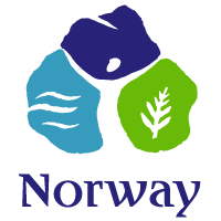


This Norway logo is a good example of figure and ground as the viewer first sees three different colored shapes and then they recognize the person in the middle. This logo has two different ways of viewing it.


This book cover is a good example of closure since the different lines and circles create a 3-d box even though it isn't complete.
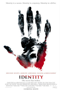


This poster is another example of figure and ground as the fingers on the hand form silhouettes of people.


This sweetened flavored drink, Cider, shows off a very subtle and interesting design. I found this design on the internet. The sideways type fot the word "cider" creates a second image when viewed upright; a smiling "emoticon." This product serves as a refreshing drink aimed at teenagers because of the digital emoticon symbol that most teens would recognize. This is a very simple and well flowing design, which is what attracted me to it. The font is well chosen, with rounded edges and a calming appeal. This drink is on shelves only in the UK.